


I'm sick of dark patterns in my favorite apps trying to empty my wallet
Exposing deceptive app design

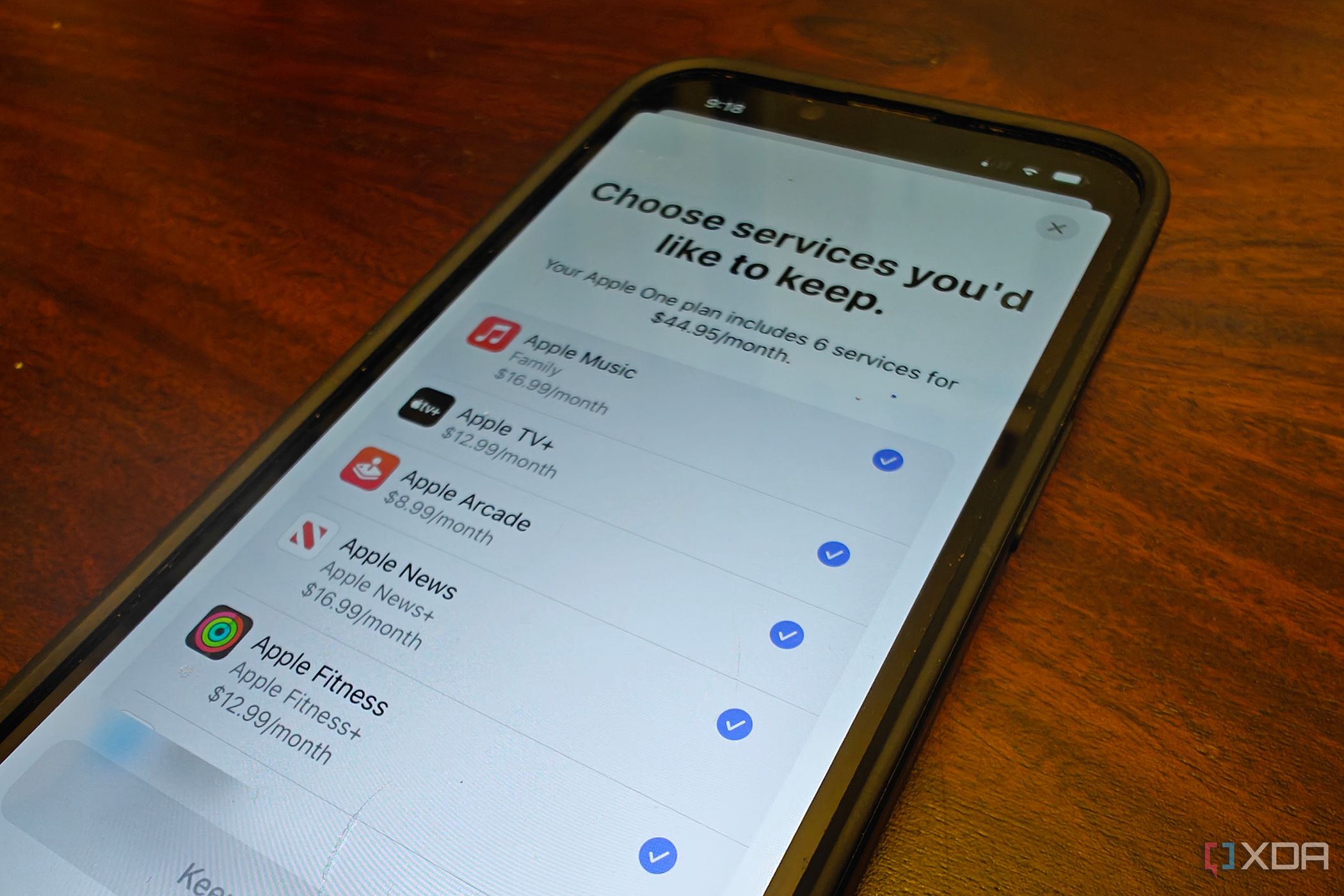
Signing up for a paid online service takes fewer steps than canceling a subscription, and Unsubscribe links in newsletters are tiny and at the bottom. Also, some shopping sites have countdown timers on their offers. These aren't arbitrary design choices. These are examples of dark patterns, experiences designed to influence user behavior in ways that benefit the business, often at the user's expense.