


![Instacart’s new Fizz alcohol delivery app is aimed at Gen Z [U]](https://i0.wp.com/9to5mac.com/wp-content/uploads/sites/6/2025/05/Instacarts-new-Fizz-alcohol-delivery-app-is-aimed-at-Gen-Z.jpg?resize=1200%2C628&quality=82&strip=all&ssl=1)


Netflix subscribers say its ‘new design sucks’ but I hope it keeps the new vertical discovery feed
Subscribers aren't happy with Netflix's new design changes.
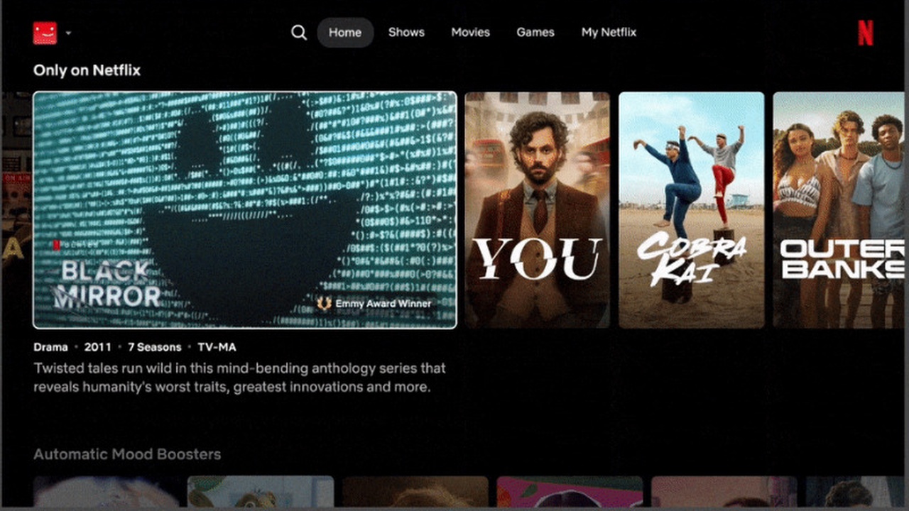
Netflix recently unveiled big updates to the design of its platform, and while there’s some interesting features to look forward to in the future, some subscribers remain unconvinced.
While the streamer started life as a place to catch your favorite shows and movies without having to traipse to the rental store, the platform has evolved over the years to play host to a plethora of video games, and various live events, including weekly WWE shows and big NFL games. The content pivot from the streamer has led to some subscribers becoming frustrated with the one-size-fits-all approach of a UI that has barely changed since its inception.
All that is due to change though, with a new homepage designed to give users the best experience with the media they mostly use the platform for, be that sports, gaming or TV and movies. Netflix's chief product officer Eunice Kim says of the project: “We wanted to create an experience that was more flexible for our broad entertainment offerings, more intuitive and responsive to our members’ needs.”
Changes include real time recommendations based on current mood and interest, extra information on titles across the platform such as “Emmy Award Winner” or “#1 in TV shows” and a new, cleaner design for the platform’s landing page.
Are all these changes a good thing?
However, these new features come with downsides too, with it being widely speculated that the removal of interactive TV specials such as Black Mirror: Bandersnatch and Unbreakable Kimmy Scmidt finale Kimmy vs the Reverend is a result of the new software no longer being able to support these types of content.
And that’s not the only thing subscribers are unhappy about, with one Reddit user stating the “NEW DESIGN SUCKS!!” and calling for the engineers responsible to be fired, comparing the new UI to the notoriously difficult to navigate Prime Video.
NEW DESIGN SUCKS!! from r/netflix
However, some responses to the original post were more positive, with one reply stating “I love the new design,” while others remained cautiously optimistic saying “I’m nervous but hopeful”.
Some of the new features look great
For my money though, while it’ll definitely take some getting used to, there are some very cool new features on the horizon.
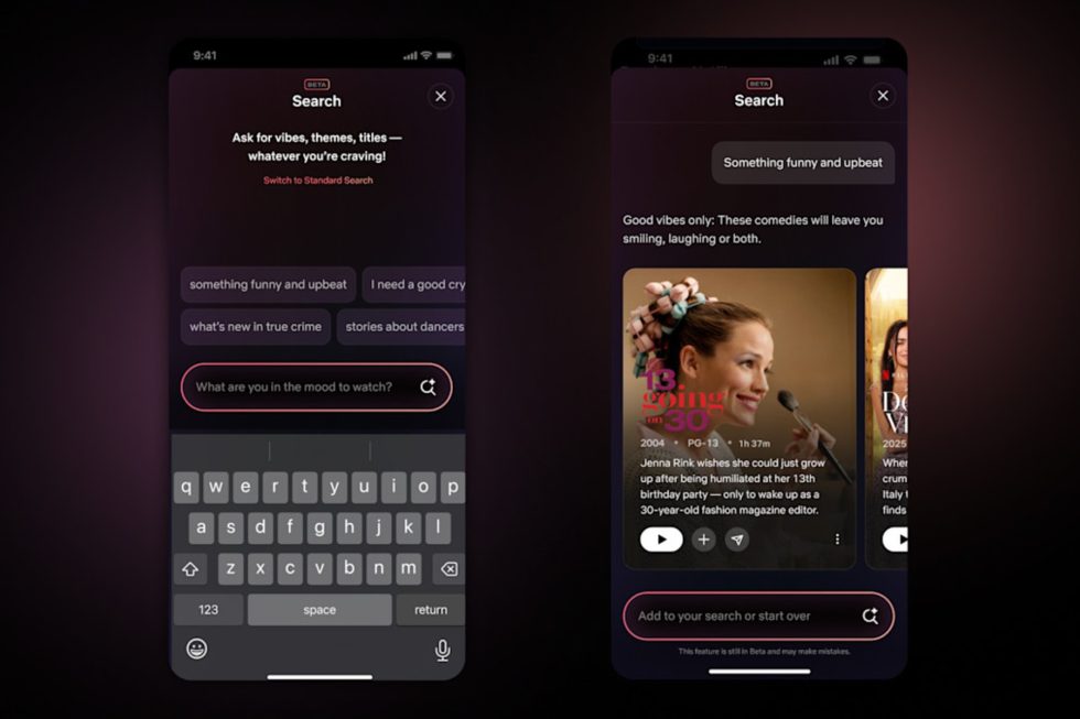
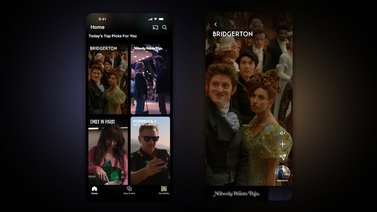
For starters, the small change of moving shortcuts for Search and My List away from the sidebar and to the top of the page will save getting bogged down in menus while trying to find basic features – I for one have changed profile more than once while trying to search for a particular show. Also intriguing is the use of Generative AI in the search function, meaning that users can use conversational phrases to zero in on the type of content they like to watch, for example “I want to watch a mid-2000s mumblecore movie” rather than scrolling through endless comedies.
One of the features I hope makes it to the new design is the vertical discovery feed – illustrated above – which is set to be tested over the coming weeks. The new feed looks to replicate the feeling of scrolling through TikTok watching movie clips, except here, if one piques your interest, rather than engage in an infuriating search through the comments to find the title, you can simply tap on the video to be taken directly to the full movie or show.
It’s definitely set to be a new era for Netflix, and one that understandably has some subscribers nervous, but with the site becoming increasingly overloaded by its breadth of content, it could be a very welcome update.