


![Walmart’s $30 Google TV streamer is now in stores and it supports USB-C hubs [Video]](https://i0.wp.com/9to5google.com/wp-content/uploads/sites/4/2025/05/onn-4k-plus-store-reddit.jpg?resize=1200%2C628&quality=82&strip=all&ssl=1)


-xl-xl-xl.jpg)


Google is giving the classic G logo a striking new look
Google is finally updating the four-color G logo after 10 years, with a fun new rainbow gradient.
- Google introduced its four-color G logo back in 2015.
- The Google app on both iOS and Android has now started deploying a new G logo with a gradient spread to its colors.
- The new rainbow G has yet to appear on other Google products.
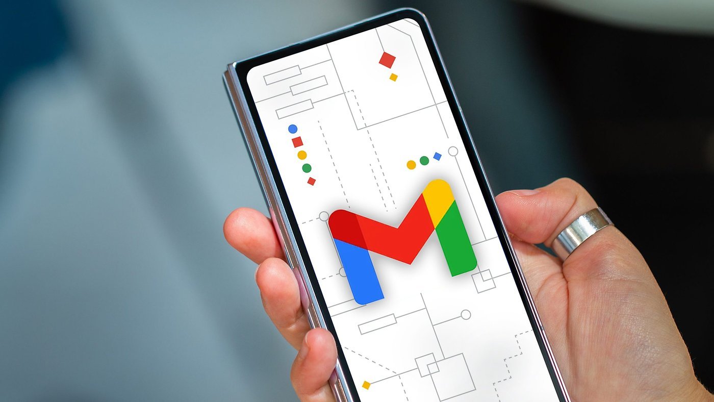
Is there any branding in modern tech more iconic than the rainbow-colored Google logo? It’s taken a lot of forms over the years, and just about one decade ago, we saw Google condense its wordmark down into a multi-color, segmented G. It’s almost hard to believe we’ve been seeing that same G icon on our phone screens this whole time, but now it’s finally getting a change.
Instead of a four-color G built from components matching letters from the original wordmark, Google is starting to roll out a new look for the G that instead spreads its colors across a smoothly changing gradient. The crew over at 9to5Google spotted this change surfacing in Google’s Search app for iOS, and now Android Authority can confirm it’s similarly beginning to arrive on Android.